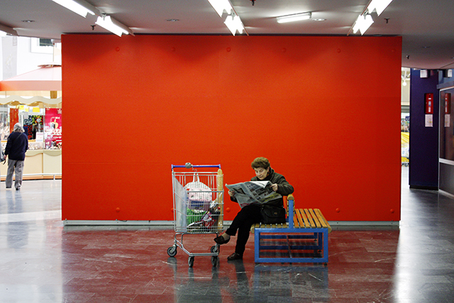
Ralentir les battements de paupières

Slowing Down Eye Fluttering, 2011
site-specific intervention, art center Le Parvis in Ibos (France)
Voice : Sylvie Bariol
Mono Sound, 6’ 20”
Text of voice played near the Hypermarket’s checkout counters
In self-service, visual merchandising replaces the sales person. The aim is to encourage shoppers to make unplanned purchases.
The store’s layout, the width and configuration of aisles, the arrangement of category areas and merchandise, lighting, music, colors… everything must be designed to influence customer behavior and prompt them to make unexpected decisions.
Customers are dextrogyne. They tend to look first to the right. They also tend to circumvent obstacles by the right. So they are generally made to enter the store on the far right end of the checkout counters. There they will find on their right products that they hadn’t necessarily planned to buy and that require some reflection. They’ll have time to think it over as they shop.
Everything must be done to slow down their progress. It’s crucial that they pass by as much merchandise as possible. For this reason, the so called “landing strips” will be wider to entice customers to go to the rear of the store.
Conversely, the aisles leading to the checkout counters should be less wide.
The more extensive a category area, the more time it takes to walk through it and therefore the greater the probability of impulse buying. Hence, the extremely large size of a store is an asset. But it mustn’t be a tiresome experience. On the contrary. Customers must have a sense of abundance and freedom. Shoppers will find beverages positioned by the checkout counters. They’d rather find large bottles (particularly packs of water) near the entrance so they can put them on the bottom of their shopping carts under other products. But this desire cannot be satisfied because such items would fill up the cart leaving too little room for unplanned purchases. The products shoppers are planning to buy are called “loss leaders.” There’s no need to draw attention to them since shoppers will find them no matter what. For this reason, such products should be placed in less eye-catching zones of the store that would not normally attract shoppers. Thanks to such ingenious positioning, as customers look for specific merchandise they’ll see products they weren’t planning to buy and this may entice them to make impulse purchases.
When shopping, customers can adopt one of two approaches: a determined approach and an impulsive approach.
– in a determined approach, shoppers have preset targets and behave in a rational way to make optimal use of their capital of time.
– in an impulsive approach, shoppers behave in an illogical manner, drawn to what attracts them at any given moment. The goal is to lead customers to adopt such irrational behavior.
The organization of the gondolas is based on the same strategic requirements. Impulse purchasing merchandise are placed on the endcaps. Large quantities of a single product are arranged there according to the principles of “mass merchandising.” Developed in the United States in the 1950s, this technique serves to offset a product’s weak visual appeal by giving the impression of inexpensive abundance. This appearance can be perfectly misleading. To avoid a corridor effect that could feel oppressive to customers, the height of gondolas has to be limited. The merchandise on the shelves must be carefully aligned. An untidy heap can suggest a good buy and make restocking easier, but an impression of order and clarity will be strongly appreciated by customers. It will give them a sense of well-being. The arrangement of products is dictated by eye movements. Since eye movements tend to be horizontal, a horizontal display lets shoppers conveniently scan the variety of products they’re looking for. But it will not entice them to linger on other products. To slow them down, priority will be given to vertical merchandising, alternating the products shoppers are looking for with impulse buying merchandise. Items that are easy to recognize from a distance are placed on the top shelf of the gondola. On the bottom are the loss leaders (strong sales but low margins). And high margin products are arranged at eye level. A store that hasn’t been changed for a long time will look old to customers. So it is customary to remodel a store every three years. This modification of habits will prompt customers to look at previously disregardedproducts.
Music and ambient sound can draw shoppers in a given direction, influence their frame of mind and make them feel less pressed for time. They can make shoppers feel more relaxed, less guilty, and, combined with announcements, they have a persuasive effect. The musical tempo has an impact on the rhythm of movement of shoppers. The right tempo should not be too slow, since shoppers should have a sense of free flowing movement. But it should not be too fast or they will be less receptive to offers. An appropriate balance must be found. The lighting has to be adapted to the merchandise. Soft lighting is good for wines and white light for fruits and vegetables. Generally speaking, bright lighting increases the speed of visual perception. Moreover, intensely bright lighting combined with large quantities of merchandise has a hypnotizing effect on customers. We then observe a slowing down of eye fluttering.